How to Create High-Converting Prelanders for Facebook Ads: Templates and Examples for Affiliate Marketers
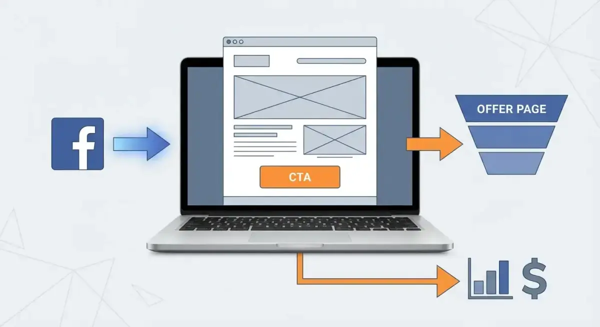
A prelander can double your conversion rate. That's not hype — it's the consistent experience of affiliate marketers who've moved from direct-linking to using bridge pages between their Facebook ads and offer pages.
In 2026, Facebook's moderation has tightened further, and users are increasingly skeptical of direct promotional content. A well-built Facebook ads prelander solves both problems: it warms up cold traffic before they see the offer, and it provides a compliance-friendly destination that passes moderation more reliably than direct offer links.
This guide gives you everything you need: the exact structure of converting prelanders, three proven templates for different verticals, a step-by-step process for analyzing competitor prelanders, and a framework for A/B testing your way to higher conversions.
Why You Need a Prelander in Your Facebook Ads Funnel
Direct-linking from a Facebook ad to an offer page is the simplest funnel. It's also increasingly the least effective one. Here's why:
Moderation barriers. Facebook rejects aggressive landing pages. A prelander wraps your offer in content, making it look like an editorial recommendation rather than a hard sell. This dramatically reduces rejection rates.
Cold traffic conversion. Users who click a Facebook ad are curious, not committed. They need context, social proof, and a reason to trust before they'll enter their email or pull out their credit card. A prelander provides that warm-up.
Quality score benefits. Facebook evaluates post-click experience as part of ad quality assessment. A content-rich prelander scores higher than a squeeze page, which means lower CPMs and better delivery.
Pixel optimization. With a prelander, you fire a PageView event on the bridge page and track the CTA click as a separate event. This gives your pixel richer data about user behavior, improving optimization over time.
Retargeting opportunity. Every visitor to your prelander gets pixeled, even if they don't click through to the offer. This creates a retargeting audience of pre-qualified users who showed interest but didn't convert — often your most valuable audience for follow-up campaigns.
Buffer against offer changes. If your affiliate network or advertiser changes their landing page, your prelander stays intact. You update the CTA link and the Facebook campaign keeps running without interruption. Without a prelander, any offer change means restarting the campaign approval process.
The math is simple: if a prelander costs you 10% of visitors who would have clicked through directly but doubles the conversion rate of those who do click through, you're way ahead.
One more advantage worth noting: prelanders give you creative control over the narrative. With direct-linking, you're at the mercy of whatever the advertiser puts on their landing page. With a prelander, you control the story, the angle, and the emotional journey — and you can tailor it to your specific audience segment and traffic source.
Three Prelander Formats That Convert
Not every prelander format works for every vertical. Here are the three proven formats and when to use each.
Format 1: The Advertorial
Designed to look like an editorial article on a news site. Includes a news-style headline, expert photo, quotes, and a product recommendation presented as organic editorial content.
Works best for: nutra, finance, insurance, crypto, health supplements.
Why it converts: People trust editorial content more than advertising. When a prelander looks like a real article on a real news site, the product recommendation feels organic rather than promotional.
Key elements:
- Publication logo (fictional but believable)
- Fresh publication date (today or yesterday)
- Author photo with name and title
- Reader comments with avatars and dates
- Product mention woven naturally into the narrative
- CTA as an organic in-text link, not a button
- "Related articles" section for authenticity
Critical rules: Don't impersonate real publications (legal risk). Create a believable but clearly fictional publication name. Keep the tone journalistic — facts, data, expert opinions.
Format 2: The Quiz
An interactive page with 3-7 questions that segments the user and leads to a personalized result with a product recommendation.
Works best for: fintech, education, health, SaaS, personalized services.
Why it converts: The quiz creates psychological investment — after answering 5 questions, users feel committed to seeing the result. The personalized recommendation feels tailored rather than generic, which builds trust.
Key elements:
- Progress bar (essential — motivates completion)
- Simple questions (one per screen, maximum 7)
- Personalized result with explanation
- CTA tied to "your recommended plan/product"
- Optional email capture before showing results (for lead gen)
Critical rules: Keep questions genuinely relevant to the product. Users will bounce if questions feel random or manipulative. The result must feel logically connected to their answers.
Format 3: The Story
A first-person narrative from a real (or realistic) person describing their problem and how the product solved it. Highly emotional and engaging.
Works best for: weight loss, income opportunities, dating, gambling, lifestyle products.
Why it converts: Identification. The reader sees someone "just like them" with a similar problem and automatically projects the solution onto themselves. The emotional arc (problem → skepticism → discovery → result) is deeply persuasive.
Key elements:
- Author photo in a natural setting (not stock)
- Specific personal details (city, age, profession)
- Emotional story with conflict, initial skepticism, and resolution
- CTA framed as "try it yourself" or "what worked for me"
- Friend/peer comments under the story for social proof
Critical rules: The story must feel authentic. Too-perfect success stories trigger suspicion. Include doubt, setbacks, and imperfect details to make it feel real.
Anatomy of a Converting Prelander
Regardless of format, every converting Facebook ads prelander follows a six-part structure:
 The six building blocks of a high-converting prelander
1. Hook Headline
You have 3 seconds. The headline must be specific, create curiosity, and match the ad copy that brought the user here.
Proven formulas:
- "How a profession from city achieved result in timeframe"
- "Why experts/doctors/marketers are recommending solution in 2026"
- "The number secret that target audience doesn't know about topic"
2. Opening Paragraph
Amplifies the pain point or curiosity. One or two sentences that compel the reader to continue. No generic filler — get straight to the point.
3. Main Content
The core of the prelander. For advertorials, it's facts and research. For quizzes, it's questions. For stories, it's the narrative arc. Every paragraph should push toward the next one.
4. Social Proof
Comments, reviews, result screenshots, media mentions. Don't overload it — 3-5 elements are enough. Quality beats quantity.
5. CTA Block
A clear call to action with a button. Not "Learn More" — make it specific: "Get Your Free Consultation," "Claim 50% Off," "Take the 2-Minute Test."
6. Trust Footer
Privacy policy, disclaimer, contact information. Essential for Facebook moderation. Include a real email address and physical address (virtual office is fine).
How to Find and Analyze Competitor Prelanders
Building prelanders from scratch is slow. Starting by analyzing what already works for competitors is faster and more cost-effective. The problem: Facebook Ad Library shows only creatives and ad copy, not destination URLs — meaning competitor prelanders remain invisible.
Adligator solves this. The platform reveals destination URLs for every ad and lets you filter by domain, exposing the complete competitor funnel: from creative to prelander to final offer.
 Using Adligator to find and analyze competitor prelanders via destination URLs
Step-by-Step Competitor Analysis
- Find competitors by keyword. Search your vertical's keywords in Adligator (e.g., "weight loss," "trading app"). Sort by days active — ads running 10+ days are likely profitable.
- Filter by domain. Use the Domain Zone filter to identify typical prelander domains (
.xyz,.io, unusual TLDs). Non-standard domains often indicate affiliate funnels. - Analyze destination URLs. Click any ad — Adligator shows where the link goes. Copy the prelander URL and study its structure, design, and CTA.
- Track patterns. If multiple competitors use the same prelander format (e.g., advertorials in nutra), that's a strong signal the format works.
- Save to collections. Use Adligator bookmarks to build a library of effective prelanders organized by vertical.
- Set up trackers. Create Live Filter Trackers for key competitors. Adligator Pro includes 7 trackers, Team includes 14 — allocate them strategically.
Try Adligator free — analyze competitor prelanders and find proven funnels in minutes.
Technical Optimization Checklist
Even the best content won't convert if the page loads slowly or doesn't work on mobile.
Page Speed
- Target: under 2 seconds on mobile (3G/4G). Every extra second costs 7-10% in conversions.
- Compress images (WebP format, not PNG/JPG).
- Use a CDN for global delivery.
- No heavy scripts before main content loads.
- Lazy load images below the first viewport.
Mobile First
80%+ of Facebook traffic is mobile. Your prelander must be mobile-first:
- Font size: minimum 16px.
- Buttons: minimum 44x44px touch target.
- No horizontal scrolling.
- CTA visible without scrolling (or sticky button at bottom).
Tracking Setup
- UTM parameters for every prelander variant.
- Facebook Pixel on the prelander (PageView) and offer page (Lead/Purchase).
- Conversions API (CAPI) for server-side tracking — essential post-iOS 14.5.
- Heatmaps (Microsoft Clarity — free) for behavior analysis.
- Custom events for scroll depth and CTA visibility.
Facebook Moderation Compliance
- No guaranteed results.
- No before/after photos (especially health/beauty).
- Disclaimer required and visible.
- No personal attribute targeting in headlines ("Do you struggle with weight?").
- Page must look like real content, not advertising.
- Privacy policy and terms of service links in footer.
A/B Testing Your Prelanders
One prelander is a hypothesis. Only testing reveals what actually converts.
 The systematic A/B testing process for prelander optimization
What to Test
- Prelander format: Advertorial vs. quiz vs. story. Start with two formats.
- Headline: The highest-impact element. Test 3-5 variations.
- Content length: Short (300 words) vs. long (800+ words). Winners vary by vertical.
- CTA: Button text, color, position (sticky vs. inline).
- Social proof: With/without reviews, number of reviews, format (text vs. screenshots).
Metrics That Matter
- Prelander CTR (CTA clicks / prelander visits) — target: 30-60%.
- Offer conversion rate (conversions / CTA clicks) — the primary metric.
- Time on page — under 15 seconds means content isn't engaging.
- Scroll depth — at least 70% should reach the CTA.
- Bounce rate — target: under 40%.
Testing Process
- Run 2 variants with equal traffic (50/50 split).
- Wait for minimum 100 clicks per variant.
- Compare offer conversion rate (not prelander CTR — it can be misleading).
- Winner becomes control. Launch next test.
- Never stop testing. Even winning prelanders fatigue over time.
Common Prelander Mistakes
Avoid these traps that kill conversions or get accounts banned:
- Message mismatch. If the ad promises "lose weight in 7 days" but the prelander discusses "healthy lifestyle" — users bounce. Keep messaging consistent throughout the funnel.
- Too many CTAs. One prelander, one action. Don't offer choices between "buy," "subscribe," and "download."
- Ignoring mobile. Test on a real phone, not just browser DevTools. Touch targets, load times, and readability differ drastically.
- Fake-looking testimonials. Too-perfect comments kill trust. Add imperfect details, realistic language, and varied lengths.
- No analytics. Without tracking, you can't know if the prelander works. Set up pixel and UTM tags before launch, not after.
- Copying competitors 1:1. Adapt the strategy, not the content. Facebook detects duplicates, and competitors can report you.
- Slow loading. If your prelander takes 4+ seconds to load on mobile, you've already lost half your audience.
- No disclaimer. Especially in health, finance, and gambling verticals. Missing disclaimers trigger moderation flags and can get your account restricted.
- Neglecting the post-click flow. The prelander is only part of the funnel. Make sure the transition from prelander to offer page is seamless — matching colors, messaging, and expectations. A jarring transition kills trust.
Prelander Launch Checklist
Before sending traffic, verify every item:
- Headline matches ad copy messaging
- Page loads under 2 seconds on mobile
- CTA button visible without scrolling (or sticky)
- Offer link works and is tracked (UTM + pixel)
- Disclaimer and privacy policy present
- No guaranteed results or before/after imagery
- Testimonials look natural (not too perfect)
- Mobile-responsive design tested on real device
- Heatmap or scroll tracking configured
- At least 2 variants ready for A/B testing
- Facebook Pixel firing PageView event
- Content doesn't violate Facebook Advertising Standards
FAQ
What is a prelander and why do affiliates need one?
A prelander (bridge page) is an intermediate page between your Facebook ad and the offer page. It warms up cold traffic by building context and trust before the user sees the offer. For affiliates, prelanders solve two problems: they increase conversion rates by pre-qualifying visitors, and they help pass Facebook moderation since the ad links to a content page rather than a direct sales page.
What prelander formats convert best in 2026?
The three highest-converting formats are: advertorial-style articles that mimic editorial content, quiz-style prelanders with interactive questions leading to a personalized result, and story-format pages with first-person testimonials. The best format depends on your vertical — advertorials work best for nutra and finance, quizzes for fintech and SaaS, stories for dating and gambling.
How can I find competitor prelanders?
Use Adligator to filter ads by domain or URL — it reveals where competitor traffic actually goes. Facebook Ad Library only shows creatives, not destination URLs. Adligator exposes the full funnel: from creative to prelander to final offer. Filter by Domain Zone and sort by days active to find proven competitor funnels.
Conclusion
A high-converting Facebook ads prelander comes down to three things: the right format for your vertical, solid technical execution, and continuous testing. Start with one of the templates above, analyze what competitors are doing successfully, build your version, and iterate.
The affiliates who consistently outperform aren't necessarily more creative — they're more systematic. They study what works, test methodically, and scale winners. A spy tool like Adligator turns hours of manual research into minutes of targeted competitive intelligence.
Key takeaways to remember:
- Choose format by vertical. Advertorials for nutra/finance, quizzes for fintech/SaaS, stories for dating/gambling.
- Follow the six-part structure. Hook → lead → content → social proof → CTA → trust footer.
- Analyze competitors systematically. Use Adligator to find proven funnels and study what's passing moderation.
- Test everything. One prelander is a guess. Two variants with measurement is a strategy.
- Optimize technically. Speed, mobile responsiveness, and proper tracking are non-negotiable.
Ready to find winning prelander strategies? Try Adligator free — analyze competitor funnels and find proven prelander templates in minutes.