How to Build a Media Buying KPI Dashboard: Metrics, Templates, and Reporting Workflow
Most media buyers drown in data. Facebook Ads Manager alone throws dozens of metrics at you — impressions, reach, frequency, CPM, CPC, CTR, conversions, ROAS — and that is just one platform. Without a structured media buying KPI dashboard, you end up either over-reporting (50-tab spreadsheets nobody reads) or under-reporting (gut-feel decisions that burn budget).
This guide walks you through building a dashboard that actually drives decisions. You will learn which metrics matter at each level, how to structure your reporting cadence, and how to add competitive intelligence as a layer most media buyers miss entirely.
Whether you manage a single brand or ten client accounts, the framework scales. No expensive BI tools required — though we will cover when they make sense.
The Media Buyer Metric Hierarchy: What Actually Matters
Not all metrics are created equal. The biggest mistake in building a media buying KPI dashboard is treating every number with the same weight. Impressions and CTR tell a different story than ROAS and revenue — and confusing the two leads to bad optimization decisions.
Think of your metrics in three tiers:
Tier 1: Business Outcomes (Check Daily, Optimize Weekly)
These are the numbers your client or CFO cares about:
- ROAS (Return on Ad Spend) — Revenue divided by ad spend. The single most important metric for ecommerce. Target varies by margin, but 3x+ is a common baseline.
- CPA (Cost Per Acquisition) — How much you pay for each conversion. For lead gen, this is your north star.
- Revenue / Lead Volume — The absolute number, not just the ratio. A 10x ROAS on $50 spend is not a win.
- Profit Margin — If you have product cost data, track actual profit, not just revenue.
Tier 2: Efficiency Indicators (Check Daily, Act on Trends)
These explain why your Tier 1 metrics move:
- Conversion Rate — Landing page or funnel conversion percentage. Low conversion rate with good CTR = landing page problem, not ad problem.
- CPM (Cost Per Mille) — What you pay per 1,000 impressions. Rising CPM signals audience saturation or increased competition.
- CPC (Cost Per Click) — Useful for comparing ad creative performance within the same campaign.
- CTR (Click-Through Rate) — Measures creative resonance. Industry average for Facebook feed is 0.9–1.5%, but benchmarks vary wildly by niche.
Tier 3: Diagnostic Metrics (Monitor Weekly, Investigate Anomalies)
These rarely drive direct decisions but explain deeper patterns:
- Frequency — How many times the average person sees your ad. Above 3–4 for cold audiences, creative fatigue is likely.
- Reach — Total unique people who saw your ad. Matters for awareness campaigns.
- Relevance Score / Quality Ranking — Facebook's internal signal for ad quality.
- Impression Share by Placement — Where your ads actually show (Feed vs. Stories vs. Reels vs. Audience Network).
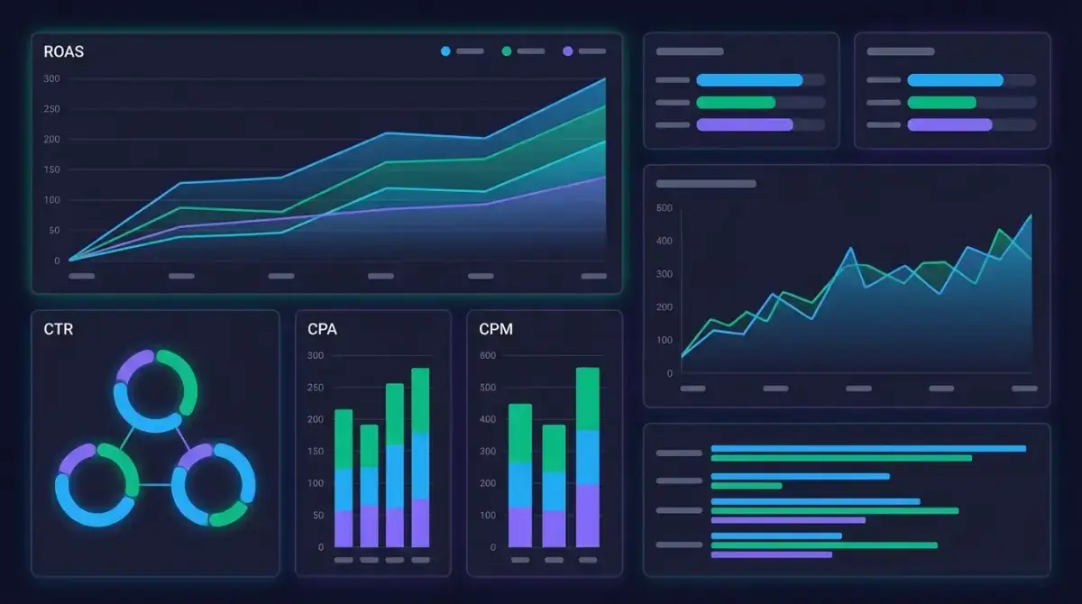
 Organize your KPIs in a hierarchy — vanity metrics at the base, business outcomes at the top.
The hierarchy matters because it dictates dashboard layout. Tier 1 metrics go at the top of every report, visible at a glance. Tier 2 gets the middle section. Tier 3 lives in expandable detail views or appendices.
Dashboard Architecture: Choosing the Right Tool
Your dashboard tool depends on budget, team size, and data complexity. Here is a realistic comparison:
Google Sheets / Excel (Free, Manual)
Best for: Solo media buyers, small accounts, budgets under $5K/month.
- Pull data via CSV exports from Ads Manager
- Build pivot tables and conditional formatting
- Use Google Sheets templates with IMPORTRANGE for multi-account views
Limitations: Manual data entry, no real-time updates, breaks above 5–10 campaigns.
Google Looker Studio (Free, Semi-Automated)
Best for: Freelancers and small agencies needing automated client reports.
- Direct Facebook Ads connector (via Supermetrics or free connectors)
- Drag-and-drop chart builder
- Scheduled email delivery of PDF reports
- Shareable dashboards with view-only access
Limitations: Limited data blending, connector costs for premium data sources, slow with large datasets.
Paid BI Tools (Databox, Whatagraph, DashThis)
Best for: Agencies managing 10+ clients who need white-labeled, automated reporting.
- Pre-built Facebook Ads templates
- Multi-channel data blending (Facebook + Google + TikTok in one view)
- Client portals with custom branding
- Automated alerts and anomaly detection
Limitations: Monthly cost ($50–$300+), learning curve, potential data lag.
Custom Build (Looker, Tableau, Power BI)
Best for: In-house teams with dedicated analysts and complex attribution needs.
- Full control over data models and calculations
- Custom attribution windows and cross-platform modeling
- SQL-based queries for advanced analysis
Limitations: Requires technical resources, significant setup time, ongoing maintenance.
The practical recommendation: Start with Google Looker Studio. It is free, connects directly to Facebook Ads, and handles 80% of media buyer reporting needs. Graduate to paid tools only when you hit a specific limitation — not because the tool looks shinier.
Dashboard Template: The Essential Layout
Here is a template structure that works for Facebook Ads media buying. Adapt it to your specific KPIs, but keep the hierarchy:
Section 1: Executive Summary (Top of Dashboard)
| Metric | This Week | Last Week | Change | Target |
|---|---|---|---|---|
| Total Spend | $12,450 | $11,200 | +11.2% | $12,000 |
| Revenue | $48,600 | $41,800 | +16.3% | $45,000 |
| ROAS | 3.9x | 3.7x | +5.4% | 3.5x |
| CPA | $18.20 | $19.50 | -6.7% | $20.00 |
| Conversions | 684 | 574 | +19.2% | 600 |
This section answers one question: "Are we on track?" Green/red conditional formatting makes it scannable in three seconds.
Section 2: Campaign Performance Breakdown
Group by campaign objective or product line:
- Prospecting campaigns — CPM, CTR, CPC, landing page conversion rate
- Retargeting campaigns — ROAS, CPA, frequency, conversion rate
- Lookalike campaigns — CPA trend, audience saturation rate, scale potential
Include sparkline charts for 7-day and 30-day trends. A single data point means nothing — trends tell the story.
Section 3: Creative Performance
This is where most dashboards fail. You need:
- Top 5 creatives by ROAS — with thumbnail preview if possible
- Bottom 5 creatives by CPA — candidates for pause
- Creative fatigue signals — CTR declining over 7 days + frequency rising
- Format breakdown — performance by image vs. video vs. carousel
Section 4: Audience Insights
- Top performing audiences by CPA and ROAS
- Audience overlap indicators (if running multiple ad sets)
- Geographic breakdown — especially relevant for multi-geo campaigns
- Device split — mobile vs. desktop conversion rates often differ dramatically
Section 5: Budget Pacing
- Daily spend vs. target (line chart)
- Projected monthly spend at current pace
- Budget utilization by campaign
- Recommendations for reallocation
Building Your Reporting Workflow: Daily, Weekly, and Monthly Cadence
A dashboard without a review cadence is just a pretty picture. Here is the reporting workflow that keeps your media buying KPI dashboard actionable:
Daily Check (5–10 Minutes)
- Spend pacing: Are campaigns spending on budget? Look for underspend (delivery issues) and overspend (budget caps not working).
- Anomaly scan: Any metric swinging more than 20% from yesterday? Investigate immediately.
- Creative health: Any ad with frequency above 4 and declining CTR? Queue replacement creative.
Weekly Deep Dive (30–60 Minutes)
- Campaign ROAS review: Pause campaigns below threshold. Scale campaigns above target.
- Creative rotation: Replace fatigued creatives. Test new formats.
- Audience analysis: Check which audiences are saturating. Plan expansion or refresh.
- Competitor pulse check: What new creatives are competitors running? (More on this below.)
- Budget reallocation: Shift budget from underperformers to winners.
Monthly Strategic Review (60–90 Minutes)
- Month-over-month trend analysis: Are CPMs rising? Is CPA trending up? What external factors might explain it?
- Creative theme analysis: Which messaging angles performed best? What patterns emerge?
- Channel mix review: Should you shift budget between Facebook, Instagram, and Audience Network?
- Funnel analysis: Where are drop-offs happening? Is it an ad problem or a landing page problem?
- Goal recalibration: Adjust targets based on actual performance and seasonal factors.
 A simple four-step weekly reporting cycle keeps your dashboard actionable.
Document your workflow. Write it down. A reporting cadence that lives only in your head dies the first time you go on vacation or onboard a new team member.
Adding Competitive Intelligence to Your Dashboard
Here is where most media buyer metrics dashboards fall short: they only track your own data. You see your CPA rising but have no idea if it is a market-wide CPM increase, seasonal competition, or your creative going stale.
Competitive intelligence fills that gap. Specifically, tracking what competitors are running — their creative formats, messaging angles, offer structures, and longevity signals — gives you context that Ads Manager simply cannot provide.
What Competitor Data to Track
Add these columns to your weekly reporting template:
- New competitor creatives spotted — volume and format breakdown
- Competitor creative longevity — ads running 14+ days likely perform well (otherwise they would be killed)
- Messaging themes — what angles are competitors pushing? Discounts? Social proof? Urgency?
- Format trends — are competitors shifting to video? Carousel? UGC-style?
- Landing page patterns — what offers and funnel structures are they testing?
How Adligator Fits Into Your Dashboard Workflow
Manually checking the Meta Ad Library every week is possible but painfully slow. You cannot filter by days active, format, language, or CTA type. You cannot track changes over time. And you definitely cannot do it across multiple competitors at scale.
Adligator solves this by giving you searchable, filterable access to millions of Facebook and Instagram ads across 234 countries. You can:
- Filter by days active to find proven winners (ads running 7+ days are likely profitable)
- Search by keyword, advertiser, or domain to monitor specific competitors
- Filter by ad format, CTA button type, language, and platform for granular analysis
- Set up live filter trackers that automatically surface new competitor creatives matching your criteria
 Adligator surfaces competitor creative data you cannot pull from your own Ads Manager.
Ready to add competitive intelligence to your reporting? Try Adligator Free — Add Competitive Intelligence to Your Dashboard
The practical integration: every Monday, spend 15 minutes in Adligator checking your top 3–5 competitors. Note new creative formats, messaging shifts, and any ads with high longevity. Add a "Competitive Intel" section to your weekly report. This context transforms your dashboard from a rearview mirror into a forward-looking strategic tool.
Common Dashboard Mistakes (and How to Avoid Them)
After building dashboards for hundreds of campaigns, these are the patterns that consistently waste time and lead to bad decisions:
Mistake 1: Tracking Too Many Metrics
More data does not mean better decisions. If your dashboard has 30+ metrics, nobody reads it. Ruthlessly cut to the 8–12 metrics that actually drive action for your specific business model.
Mistake 2: No Benchmarks or Targets
A CPA of $22 means nothing without context. Is your target $20 or $30? Was last month $25 or $18? Always include comparison columns: vs. target, vs. last period, vs. last year (if available).
Mistake 3: Reporting Without Recommendations
A dashboard that shows numbers without actionable recommendations is a data dump, not a reporting tool. Every weekly report should end with 3–5 specific next actions: "Pause Creative X," "Increase budget on Campaign Y by 20%," "Test UGC format for product Z."
Mistake 4: Ignoring Attribution Windows
Facebook's default 7-day click / 1-day view attribution window inflates results compared to Google Analytics. Pick one source of truth and stick with it. Document which attribution model your dashboard uses so everyone reads the numbers the same way.
Mistake 5: Never Auditing the Dashboard Itself
Dashboards go stale. Metrics that mattered six months ago may be irrelevant now. Review your dashboard structure quarterly. Remove metrics nobody looks at. Add new ones that reflect current strategy.
Mistake 6: No Competitive Context
Your CPM jumped 30% this week. Is it your targeting? Algorithm changes? Or did three new competitors enter your niche and drive auction prices up? Without competitive intelligence in your reporting, you are optimizing in a vacuum.
Automation Tips: Reducing Manual Reporting Time
The goal of a good ad campaign reporting system is to minimize time spent building reports and maximize time spent acting on insights. Here are practical automation steps:
- Automate data pulls. Use Supermetrics, Funnel.io, or Facebook's Marketing API to pipe data directly into your dashboard tool. No more CSV exports.
- Set up automated alerts. Configure email or Slack notifications for: CPA exceeding target by 20%+, daily spend pacing off by 15%+, CTR dropping below threshold on any active creative.
- Template your reports. Build a master template once. Each week, the data refreshes automatically — you only need to write the analysis and recommendations.
- Schedule delivery. Looker Studio and most paid tools support scheduled PDF delivery. Clients get reports at the same time every week without you lifting a finger.
- Batch your competitor research. Instead of checking competitors ad-hoc, block 15–20 minutes every Monday morning. Use Adligator's saved trackers to get notified when competitors launch new creatives matching your filters.
The time savings compound. A well-automated dashboard workflow takes 30 minutes per week to maintain. A manual one takes 3–4 hours. Over a year, that is 150+ hours reclaimed for actual strategy work.
FAQ
What metrics should a media buying KPI dashboard include?
At minimum, track ROAS, CPA, CTR, CPM, CPC, conversion rate, and spend. Add frequency and relevance score for creative health monitoring. The exact metrics depend on your campaign objectives — ecommerce teams prioritize ROAS while lead gen teams focus on CPL and lead quality.
How often should I review my media buying dashboard?
Daily checks for spend pacing and anomaly detection, weekly deep dives for optimization decisions, and monthly reviews for strategic planning and budget reallocation. Automated alerts can reduce the need for constant manual monitoring.
Can I build an effective KPI dashboard using free tools?
Yes. Google Sheets with manual data exports works for small accounts. Google Looker Studio (free) connects directly to Facebook Ads and provides automated reporting. The limitation of free tools appears at scale — when you manage multiple accounts or need competitive intelligence data alongside your own metrics.
Conclusion
Building a media buying KPI dashboard is not about collecting every possible metric — it is about organizing the right metrics in a hierarchy that drives decisions. Start with business outcomes (ROAS, CPA, revenue), explain them with efficiency indicators (CPM, CTR, conversion rate), and diagnose problems with detail metrics (frequency, placement breakdown, quality scores).
Choose a tool that matches your scale. Establish a daily-weekly-monthly review cadence. Automate the data collection so you spend time on analysis, not spreadsheet formatting. And add competitive intelligence to your workflow — because optimizing your own ads without understanding the competitive landscape is like driving with one eye closed.
Ready to add competitive intelligence to your dashboard workflow? Try Adligator Free — Add Competitive Intelligence to Your Dashboard