Winning Facebook Ad Examples Breakdown: 10 Real Ads Analyzed — Why They Work and What to Steal (2026)
Every media buyer has scrolled through their Facebook feed and thought: "That ad is crushing it — what makes it work?" The problem is that gut feeling is not a strategy. Without understanding the structural elements that make a winning facebook ad examples breakdown useful, you are just collecting screenshots.
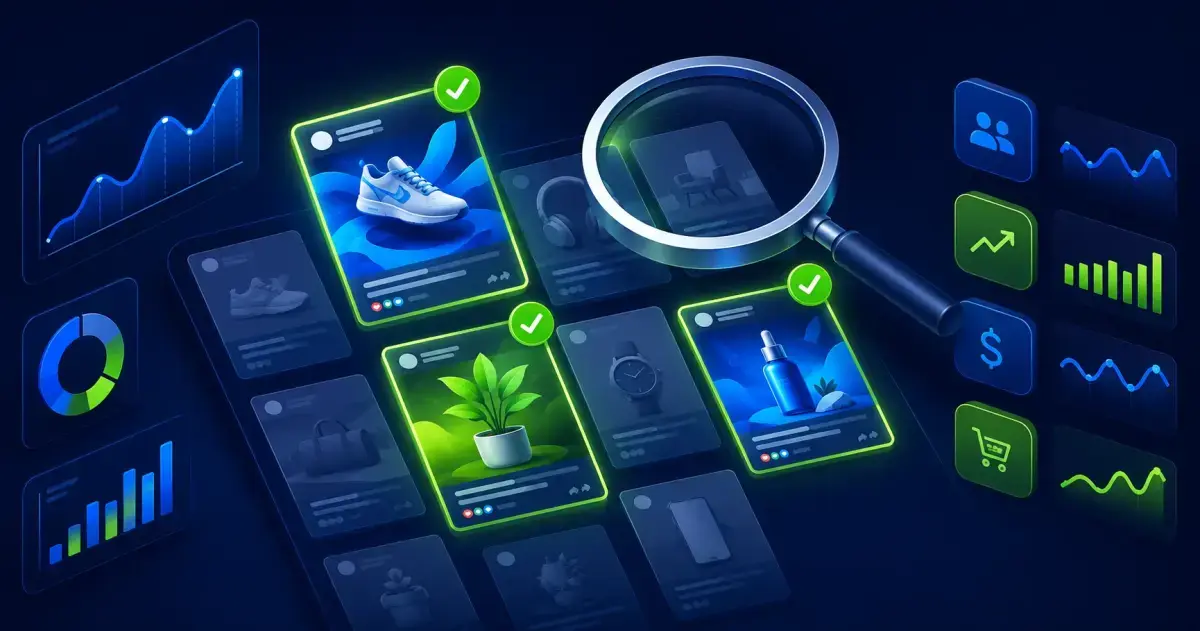
This guide is different. We analyzed 10 high-performing Facebook ads across different verticals, each running for 30+ days — the strongest signal that an ad is profitable. For each one, we break down the hook, the visual strategy, the copy structure, the offer, and the CTA mechanics. Not to copy them, but to extract repeatable patterns you can apply to your own campaigns.
Whether you run ecommerce, SaaS, lead gen, or affiliate campaigns, these breakdowns give you a practical toolkit for building better creatives faster. Every pattern identified here is backed by longevity data, not just creative opinions.
How We Selected These 10 Winning Ads
Before diving into the ads, here is the methodology. Not all "good-looking" ads are actually winning. Creative awards and engagement metrics are unreliable signals. The only metric that truly matters is whether the advertiser keeps spending money on the ad.
 Our selection criteria prioritize objective performance signals over subjective creative judgment.
Selection criteria:
- Running 30+ days. No advertiser keeps a losing ad active for a month. Longevity is the single best proxy for profitability.
- Multiple GEOs or large single market. Ads running in multiple countries or major markets (US, UK, DE) indicate scaled campaigns with proven unit economics.
- Active on multiple placements. Ads showing on both Facebook and Instagram suggest the advertiser has tested and confirmed cross-platform performance.
- Clear commercial intent. We excluded brand awareness campaigns and focused on ads designed to drive a specific action: purchase, sign-up, lead, or install.
- Diverse verticals. We deliberately selected across ecommerce, SaaS, local business, affiliate, lead gen, app, B2B, subscription, beauty, and info products.
This approach ensures every ad analyzed here has passed the only test that matters: the advertiser's own money test.
Ad 1: DTC Ecommerce — The Problem-Solution Hook
Vertical: Direct-to-consumer household product Format: Single image with text overlay Running time: 45+ days CTA button: Shop Now
The hook: "Tired of specific daily frustration? We fixed it."
This ad opens with a visceral, relatable problem. Not a generic pain point, but a specific moment the target audience experiences regularly. The first line of copy identifies the problem so precisely that the reader feels personally called out.
Why it works:
- Pattern interrupt. The problem statement stops the scroll because it triggers recognition: "That happens to me."
- Immediate solution framing. The ad does not build suspense. Within the first two lines, it presents the product as the fix.
- Visual proof. The image shows the product solving the problem in a single frame — before/after implied in one shot.
- Social proof embedded. The copy includes a short line like "Join 50,000+ customers who switched" — not as the hook, but as a reinforcement after the solution is presented.
What to steal: The specificity of the problem statement. Replace "Do you have problems with X?" with "Hate it when exact frustrating moment?" The more specific, the higher the stop rate.
How to apply this pattern:
- List the 5 most specific daily frustrations your product solves
- Write each one as a question that starts with an emotion ("Tired of...", "Hate when...", "Sick of...")
- Test each as a separate ad hook with the same visual and CTA
- The version with the highest engagement rate tells you which frustration resonates most with your audience
This pattern works exceptionally well for DTC products because the purchase decision is often emotional — people buy solutions to daily annoyances, not product features.
Ad 2: SaaS — The Demo Video That Scales
Vertical: Project management SaaS Format: 30-second screen recording with captions Running time: 60+ days CTA button: Sign Up
The hook: First 3 seconds show the end result — a completed workflow — then rewinds to show how fast it happened.
Why it works:
- Outcome-first structure. By showing the result before the process, the ad answers "will this work for me?" before the viewer even asks.
- Speed as proof. Showing a complex task completed in seconds communicates value faster than any copy could.
- Captions carry the story. No voiceover, no music — just clean captions explaining each step. This works because most Facebook video is watched on mute.
- Single use case. The ad does not try to show everything the product does. It picks one workflow the target audience does daily and shows it being done 10x faster.
What to steal: The "show the result first" structure. Most demo videos build up to the payoff. Winning SaaS ads put the payoff in the first 3 seconds and then explain how to get there.
Production tip: You do not need a production team for this. Screen recording tools like Loom or native screen capture work perfectly. The key is editing: record the full workflow, then cut to put the final result first. Add captions in your video editor or use auto-caption tools. Total production time for a winning SaaS ad in this format: 30-60 minutes.
Ad 3: Local Business — Geo-Specific Social Proof
Vertical: Home services (plumbing/HVAC) Format: Carousel of customer reviews with job photos Running time: 35+ days CTA button: Call Now
The hook: "City name: here is why 200+ homeowners switched to us this year."
Why it works:
- Geographic specificity. Mentioning the city name in the first line makes the ad feel personally relevant to local audiences.
- Review-as-creative. Each carousel card features a real customer review screenshot paired with a photo of the completed job. This is social proof and portfolio in one format.
- Urgency without fakeness. The ad mentions seasonal demand ("Before summer hits, book your service") without countdown timers or "only 3 spots left" tactics.
- Direct response. The Call Now button plus a phone number in the copy captures high-intent local leads immediately.
What to steal: The carousel-review format. Instead of a generic testimonial section on your landing page, turn your best reviews into individual carousel cards with visual proof.
Local business bonus: This format is especially powerful for service businesses because potential customers want to see two things: (1) that other people in their area trust this business, and (2) what the finished work looks like. Each carousel card delivers both simultaneously. For agencies managing local business clients, this is one of the fastest-to-produce, highest-performing creative formats available.
Ad 4: Affiliate — The Curiosity Gap Carousel
Vertical: Finance/insurance comparison Format: 5-card carousel with numbered tips Running time: 40+ days CTA button: Learn More
The hook: "5 things your service provider is not telling you about specific topic."
Why it works:
- Curiosity gap. The hook implies hidden information the viewer should know, creating psychological tension that can only be resolved by clicking.
- Numbered format. Each carousel card reveals one "thing," but the last card says "See all 5 + the one most people miss" — driving clicks to the landing page.
- Authority positioning. The ad copy positions the advertiser as an insider who knows what the industry does not want consumers to know.
- Low-commitment CTA. "Learn More" reduces friction compared to "Buy Now" or "Sign Up" — appropriate for top-of-funnel affiliate content.
What to steal: The incomplete-carousel technique. Reveal 3-4 items in the carousel but withhold the most valuable one for the landing page. This bridges the gap between ad engagement and page visits.
Compliance note: Curiosity gap ads walk a fine line with Meta's ad policies. Avoid "clickbait" language that implies the viewer has been deceived or that the content is sensational. The key is delivering genuine value in the carousel while promising additional value on the landing page — not bait-and-switch tactics that result in disapproved ads or account restrictions.
Ad 5: Lead Gen — The Quiz Funnel Ad
Vertical: Financial services (mortgage/refinance) Format: Single image with illustrated quiz interface Running time: 50+ days CTA button: Learn More
The hook: "Answer 3 questions to see if you qualify for specific benefit."
Why it works:
- Self-qualification. The quiz format lets prospects self-select, improving lead quality dramatically compared to generic form submissions.
- Low perceived effort. "3 questions" signals minimal time investment, reducing the barrier to engagement.
- Personalization promise. The ad implies the result will be tailored specifically to the viewer's situation — "see YOUR savings estimate."
- Progressive commitment. Once someone starts a quiz, completion rates are significantly higher than form fills. The ad leverages consistency bias.
What to steal: The quiz-as-ad format works in any vertical where prospects need customized recommendations. Real estate, insurance, SaaS feature selection, fitness programs — any business where the answer is "it depends" can use a quiz funnel.
Implementation detail: The most effective quiz funnel ads use 3-5 questions maximum, with the first question being the easiest to answer (often demographic or situational). Each subsequent question increases specificity. The result page should show a personalized recommendation AND include a lead capture form — the viewer has already invested effort and is much more likely to submit their information after completing the quiz than they would be on a cold landing page.
Ad 6: App Install — The Gameplay Teaser
Vertical: Mobile gaming Format: 15-second video showing gameplay Running time: 30+ days CTA button: Install
The hook: Opens with the most satisfying moment in the game — a perfect combo, a big win, or a visually stunning effect.
Why it works:
- Dopamine preview. The ad gives viewers a taste of the satisfaction they will feel playing the game, triggering a desire to experience it themselves.
- No explanation needed. The gameplay speaks for itself. No narrator saying "download the best puzzle game" — just pure visual engagement.
- Intentional imperfection. The best gaming ads show gameplay that looks achievable but slightly challenging. Too perfect feels fake. Slight mistakes make it feel real and attainable.
- Immediate CTA. The Install button appears while the viewer is still engaged from the gameplay sequence.
What to steal: Show the best moment first. Whatever your product's "aha moment" is, lead with it. Do not make viewers sit through context, setup, or explanation to get to the payoff.
Find winning ads in your specific vertical — try Adligator free to filter by days active
Ad 7: B2B — The Customer Result Video
Vertical: Marketing automation platform Format: 60-second customer interview video Running time: 45+ days CTA button: Learn More
The hook: Customer speaking directly to camera: "We went from specific before metric to specific after metric in timeframe."
Why it works:
- Third-party credibility. The claim comes from a customer, not the brand. This sidesteps the natural skepticism viewers have toward advertiser claims.
- Specific metrics. Vague testimonials ("this tool is amazing") do nothing. Specific numbers ("we cut our CAC by 40% in 3 months") give prospects a concrete benchmark.
- Production quality sweet spot. The video is well-lit and clearly planned but not overly polished. It looks like a professional interview, not a Super Bowl commercial. This preserves authenticity.
- Industry match. The customer in the ad is from the same industry as the target audience, making the result feel achievable rather than aspirational.
What to steal: The specific-metric testimonial format. If you have customers willing to share real numbers, these ads outperform almost every other B2B format.
Ad 8: Subscription — The FOMO Limited Offer
Vertical: Meal kit subscription Format: Video with product unboxing Running time: 35+ days CTA button: Get Offer
The hook: "This week only: 16 free meals across your first 5 boxes + free shipping."
Why it works:
- Calculated generosity. The offer sounds enormous (16 free meals) but is structured across multiple boxes, ensuring the customer stays subscribed long enough to develop the habit.
- Visual appeal. The unboxing video shows fresh, appetizing ingredients being unpacked — triggering sensory desire that pure copy cannot achieve.
- Scarcity framing. "This week only" creates urgency, but the ad has been running 35+ days. The offer likely refreshes weekly, keeping the urgency framing honest while maintaining performance.
- Friction removal. Free shipping eliminates the last common objection for physical product subscriptions.
What to steal: The stacked-value offer structure. Instead of "50% off," break the discount into multiple tangible benefits ("16 free meals + free shipping"). Same economics, better perceived value.
Ad 9: Beauty/DTC — The UGC Testimonial
Vertical: Skincare brand Format: UGC-style selfie video, 20 seconds Running time: 55+ days CTA button: Shop Now
The hook: Person holding the product, looking directly at camera: "Okay so I was super skeptical but..."
Why it works:
- Native format. The video looks like an organic social media post, not an ad. This bypasses ad blindness because the viewer's brain categorizes it as "content from a friend" before recognizing it as paid.
- Skepticism-to-belief arc. Starting with "I was skeptical" is more persuasive than starting with praise. It mirrors the viewer's own internal state and resolves it.
- Real skin, real lighting. The UGC creator is not a model. Normal skin, normal lighting, normal background. This makes the product results feel achievable.
- Short and focused. 20 seconds, one product, one benefit. No brand history, no ingredient lists, no "our mission" statements. Just: "I tried this, here is what happened."
What to steal: The skeptic-to-believer narrative arc. Brief UGC videos that start with doubt and end with genuine enthusiasm outperform polished brand content in almost every DTC vertical.
Ad 10: Course/Info Product — The Authority Hook
Vertical: Business education course Format: Talking head video, 45 seconds Running time: 40+ days CTA button: Sign Up
The hook: "I have spent $2M on Facebook Ads. Here are the 3 things I wish I knew on day one."
Why it works:
- Credential-first hook. The specific dollar amount establishes credibility immediately. It is not "I am an expert" — it is "here is the proof that I have done this at scale."
- Knowledge asymmetry. The "things I wish I knew" frame implies the viewer is about to receive distilled wisdom that normally takes years and millions of dollars to learn.
- Three-item structure. Three is the optimal number for retention and comprehension. The viewer can mentally commit to absorbing three insights.
- Bridge to course. After delivering 2 of the 3 insights in the ad, the third is positioned as "too detailed for a 45-second video — I break it down fully in course name." This creates a natural, non-pushy transition to the offer.
What to steal: The incomplete-value technique. Deliver genuine, useful content in the ad itself — enough that the viewer feels they learned something — then offer the complete framework behind the sale.
Common Patterns Across All Winners
After analyzing these 10 winning facebook ad examples, several structural patterns emerge that transcend verticals and formats.
 Most winning ads use one of five hook formulas — the problem-solution hook dominates across verticals.
Pattern 1: The Hook Decides Everything
Every winning ad has a hook that works in the first 1-3 seconds (video) or first line (static/copy). The five dominant hook formulas:
- Problem-Solution: "Tired of X? Here is the fix."
- Curiosity Gap: "X things your provider is not telling you."
- Result-First: "We went from X to Y in Z days."
- Skeptic-to-Believer: "I was skeptical but..."
- Authority Credential: "After spending $X on ads, here is what works."
Pattern 2: Specificity Over Cleverness
None of these ads use clever wordplay, puns, or abstract metaphors. They all use specific numbers, specific timeframes, specific results. "40% reduction in CAC" beats "dramatically improved performance" every time.
Pattern 3: One Message Per Ad
Every winning ad communicates exactly one idea. Not three benefits, not a feature list, not a brand story. One specific value proposition, reinforced through every element of the creative.
Pattern 4: Social Proof Is Structural, Not Decorative
Social proof in winning ads is not a star rating slapped at the bottom. It is woven into the creative structure — customer videos as the ad itself, review screenshots as carousel cards, specific customer counts in the hook.
 Video and UGC dominate among top-performing ads, but static images still win in specific verticals.
Pattern 5: The CTA Matches the Commitment Level
Low-commitment offers (quizzes, content, free tools) use "Learn More." High-commitment offers (purchases, subscriptions) use "Shop Now" or "Get Offer." No winning ad mismatches its CTA to its funnel position.
Pattern 6: Visual Consistency With the Landing Page
A pattern that is easy to miss: every winning ad maintains visual consistency between the creative and the landing page. The colors, imagery style, and messaging on the landing page match what the viewer saw in the ad. This continuity reduces bounce rates because the viewer feels they arrived at the right place. Ads with visual disconnects between the creative and the landing page suffer from higher bounce rates regardless of how strong the ad itself performs.
Pattern 7: Copy Length Matches Purchase Complexity
Simpler purchases (DTC products, app installs) use shorter copy — often just 2-3 lines. Complex purchases (B2B SaaS, financial services, courses) use longer copy that addresses multiple objections. The winning ads in this analysis follow this pattern exactly: gaming and beauty ads are short and punchy, while B2B and course ads provide more detailed reasoning before the CTA.
How to Find More Winning Ads in Your Vertical
Knowing what makes a winning ad is valuable. Being able to find winning ads on demand in your specific vertical is a competitive advantage.
 A systematic approach to finding winning ads beats random feed scrolling every time.
Here is a practical workflow for systematic competitive creative research:
Step 1: Define your search parameters.
- Identify 5-10 keywords relevant to your vertical
- List 3-5 direct competitors by Facebook page name or ID
- Determine your target GEOs and languages
Step 2: Filter for proven winners.
- Set the "days active" filter to 30+ days — this eliminates tests and failures
- Look at multiple placements (Facebook + Instagram) as a quality signal
- Note the creative format distribution for your vertical
Step 3: Analyze structurally, not superficially. For each winning ad you find, document:
- Hook formula (which of the 5 patterns above?)
- Visual structure (product-focused, UGC, demo, lifestyle?)
- Copy structure (problem-solution, feature-benefit, testimonial?)
- Offer mechanics (discount, free trial, quiz, content?)
- CTA alignment (matches commitment level?)
Step 4: Build your creative brief library. Instead of saving screenshots, create a brief for each pattern you identify:
- Hook template: "Hook type: specific formula"
- Visual direction: "Format: key visual elements"
- Copy framework: "Structure: key messaging elements"
- Offer framework: "Type: specific mechanics"
Step 5: Test systematically. Take the top 3-5 patterns you identified and create your own versions. Test each pattern with 2-3 variations, changing one element at a time. This ad creative analysis approach turns research directly into testable hypotheses.
The key principle: you are not looking for ads to copy. You are looking for structural patterns that work in your vertical so you can build original creatives on proven foundations.
FAQ
How do I know if a Facebook ad is actually winning?
The strongest signal is longevity. Ads that have been running for 30+ days are almost certainly profitable — advertisers do not keep spending on ads that lose money. Use ad spy tools to filter by days active and identify proven winners. Secondary signals include multi-GEO distribution, multiple placements, and high ad-to-page ratios.
Can I copy a winning Facebook ad?
You should not copy ads directly — this risks trademark issues and will not perform the same for your audience. Instead, reverse-engineer the structural elements: the hook formula, offer framing, visual style, and CTA approach. Then adapt these patterns to your product and audience. The goal is to understand why an ad works, not to duplicate what it looks like.
How many ad creatives should I test based on these examples?
Start with 3-5 creative concepts inspired by different winning patterns. For each concept, create 2-3 variations changing one element (hook, image, CTA). This gives you 6-15 variants per testing cycle, enough to find a winner without spreading budget too thin. Run each variant for at least 72 hours with sufficient budget before making decisions.
Conclusion
The best facebook ad breakdown analysis is not about admiring creative work — it is about extracting repeatable systems. Every winning ad in this guide succeeds because it follows structural patterns: specific hooks, single messages, embedded social proof, and CTA-to-commitment alignment.
Stop scrolling your feed hoping to spot winning ads by accident. Build a systematic process for finding, analyzing, and adapting proven creative patterns in your vertical. The difference between media buyers who consistently produce winners and those who rely on luck is exactly this: a structured approach to creative research.
Use the five hook formulas, the format distribution data, and the structural analysis framework from this guide as your creative research toolkit. Then build original ads on proven foundations instead of guessing what might work.
Ready to find winning ads in your vertical? Find winning ads in your specific vertical — try Adligator free to filter by days active
See which ads have been running longest in your niche right now