The Analytics dashboard: read patterns, not ads
Launches over time, visuals mix, copy patterns, country mix, plus the Heatmap. The screen that has no equivalent inside Meta's native Ad Library.
The Analytics tab is the screen that has no equivalent inside Meta's native Ad Library, no equivalent inside the Pages tab, and no equivalent at any of Adligator's competitors. Every other surface in the app shows you ads. Analytics shows you patterns. This article walks through what each panel does and how to read it.
If you have not saved a Tracker yet, do that first — Analytics is always scoped to a Tracker. There is no "general analytics" view in Adligator, by design. Patterns only mean something when they are about a specific entity you have chosen to watch.
How to open the Analytics tab
Two clicks from anywhere in the app. The example below uses an existing Tracker called headway — substitute your own tracker name.
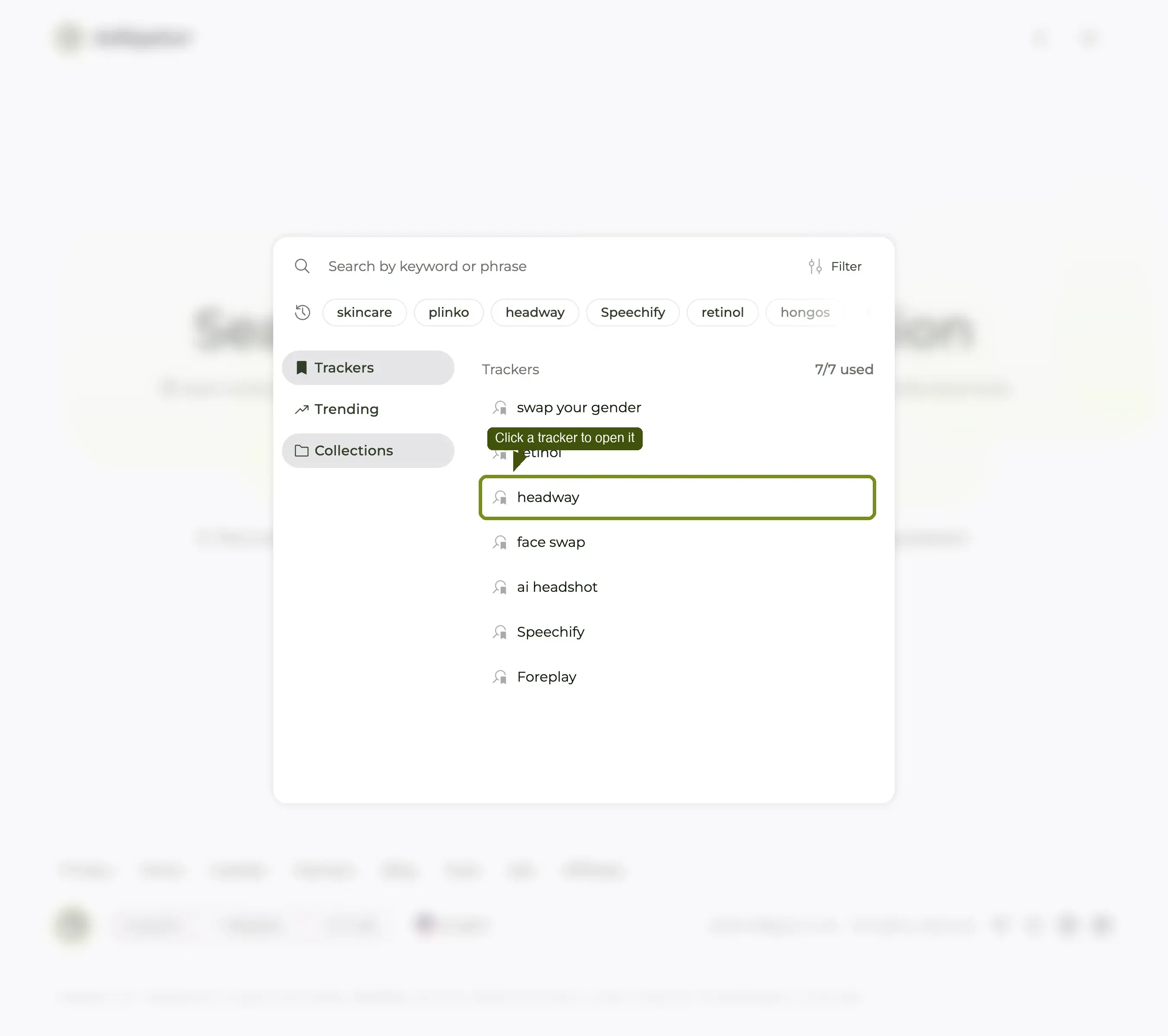
Step 1 — Open the search popup and click your tracker
Click the main search bar (or use the search-bar icon at the top of any page). The popup opens with the Trackers tab selected on the left and your saved trackers listed on the right. Click the row of the tracker you want analytics for.
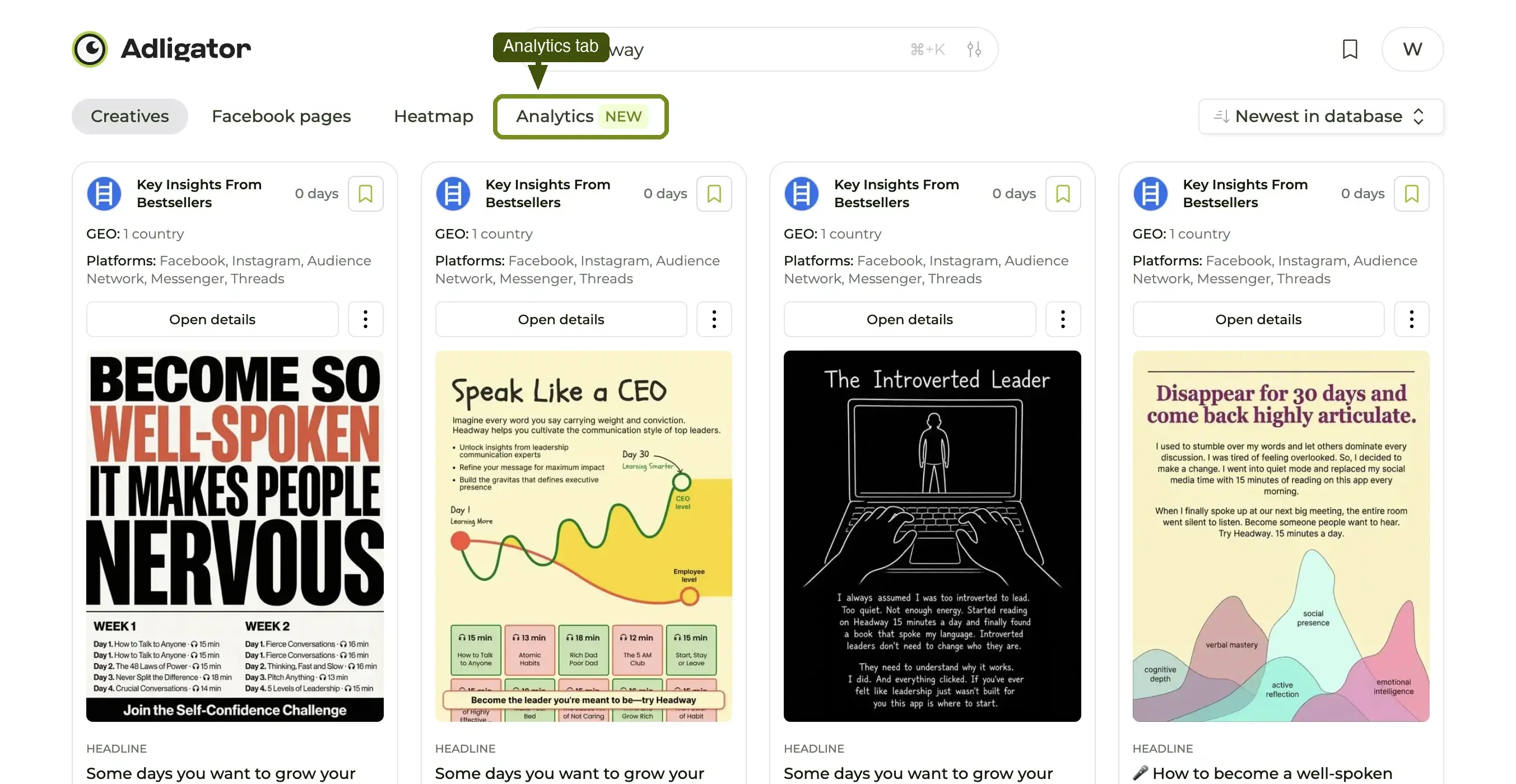
Step 2 — Switch the view from Creatives to Analytics
The tracker opens on the Creatives view (the ad feed). Above the results you'll see four tabs: Creatives, Facebook pages, Heatmap, and Analytics. Click Analytics to switch.
Step 3 — Read the dashboard
The view re-renders into a vertically-stacked dashboard: General (funnel destination + GEO mix), Launches (heatmap + amount of launched ads over time), Content (headline, CTA, primary text, links), and Visuals (colors + media format mix).
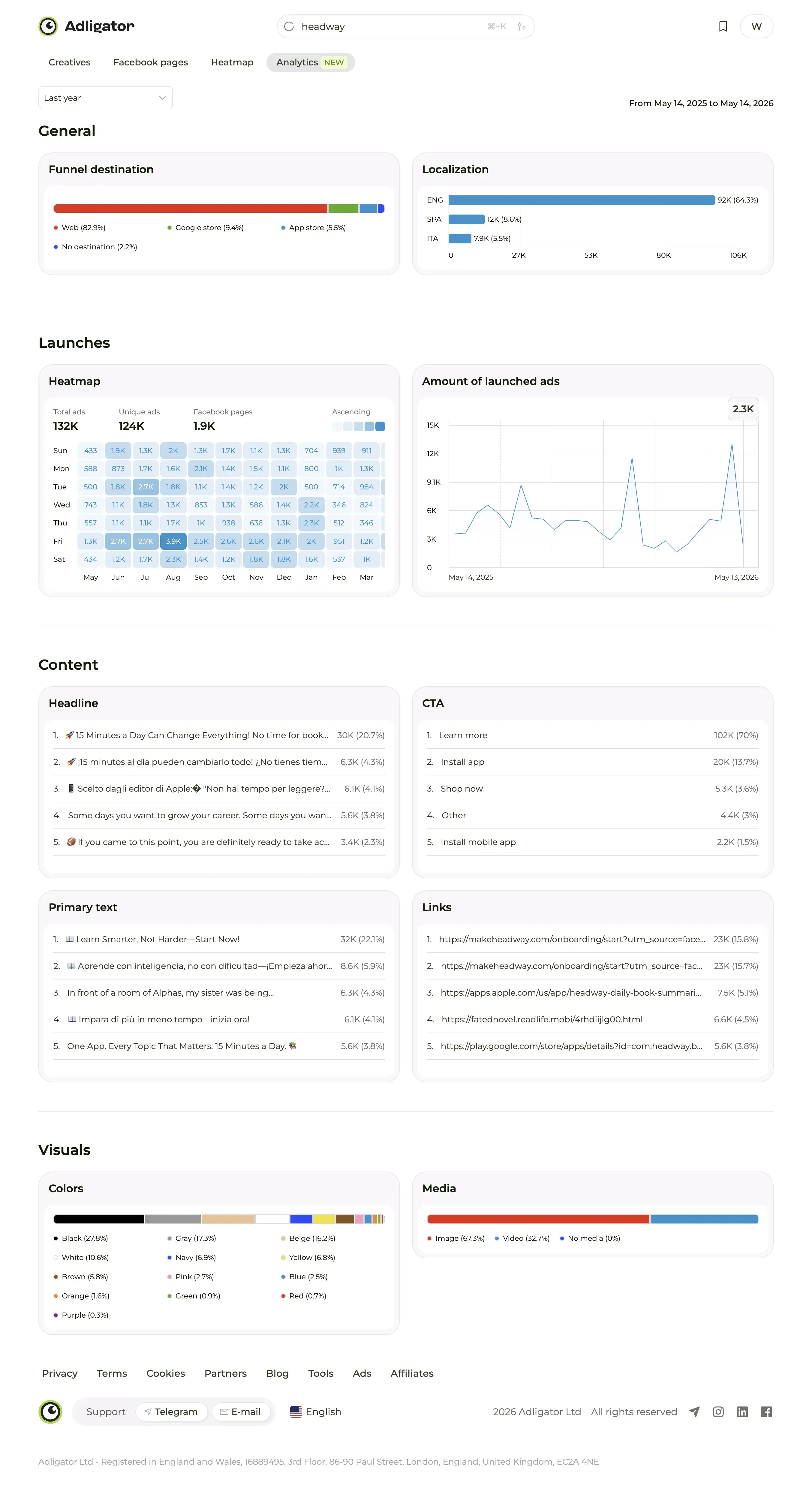
A time-range dropdown at the top lets you zoom to Last week, Last month, 3 months, 6 months, 1 year, or All time. The default shows lifetime data.
What the dashboard contains
Four panel groups stacked top-to-bottom, plus the Heatmap sub-view inside Launches. The rest of this article walks each group in detail.
Panel 1 — Launches over time
The top panel is a bar chart of new ad launches by day (or week, depending on selected range). Each bar is the count of new creative the brand pushed into market that day.
Three reading lenses:
- Volume — average bar height. A brand averaging 8 launches/day is in a different operating tier than one averaging 1/week. Volume tells you about creative-team size and budget.
- Cadence — bar pattern. Is it steady (in-house team with weekly slots), bursty (agency contract with milestone drops), or seasonal (heavy ramp in Q4)?
- Trend — slope. Volume rising over the last 90 days = scaling. Volume falling = pulling back, pivoting, or hitting fatigue.
The fastest insight from this panel is usually the cadence. Cadence rarely lies — it maps directly to how the brand has structured creative ops.
The Heatmap sub-view
Inside the launches panel, the Heatmap renders a 7-row × 24-column grid: day-of-week vertical, hour-of-day horizontal. Each cell colored by launch density.
This is where the strategic insight lives. Two examples of what you'll find:
- A brand that launches every Sunday evening is probably running a weekly creative review on Friday → designer ships on Saturday → media buyer queues for Sunday launch.
- A brand with only weekday-business-hours activity is running creative from an agency, not in-house — agencies don't ship weekends.
Hover any cell to see the exact launch count. The time range dropdown applies here too — last 7 days vs all time produces wildly different heatmaps for established brands.
Panel 2 — Visuals breakdown
A donut + samples of the format mix: % image vs video vs carousel vs DCO vs DPA, etc. Click a slice and the panel expands with sample creatives in that bucket.
What this tells you:
- Format dominance. A brand that's 70% video has either an in-house editor or a heavy production retainer. A brand that's 70% static has neither.
- DCO share. High DCO share (30%+) means the brand has enough volume to delegate creative selection to Meta's algorithm. That's a maturity signal.
- Carousel vs single-image ratio. For ecom, carousels usually carry the offer (multi-product, before/after, social proof slides). High carousel share = offer-driven creative strategy.
The samples in each slice are sortable — you can pull "their longest-running video" or "their best-performing carousel" without leaving the panel.
Panel 3 — Copy patterns
This is the panel that surprises most users on first read. Adligator parses every ad's primary text and headline, extracts repeated n-grams, and ranks them.
Three sub-blocks:
- Top phrases — the most-used 2-5 word strings across the brand's ads. The hook patterns the brand has settled on.
- Headline structures — common headline templates (e.g. "X for Y", "The N best thing").
- CTA distribution — which CTA buttons the brand uses, by share. Shop now vs Sign up vs Learn more.
What you do with this:
- If a phrase shows up in 30+ ads, it's part of the brand's tested vocabulary. Their copywriter has tested it under fire.
- If the CTA distribution skews 80% Shop now, the brand is fully transactional. If it skews 50/50 Shop now / Sign up, they're balancing direct conversion with list-building.
- Phrases that recur across both copy AND headline are the brand's positioning — that's the message they want to own.
For your own creative, this panel is the single fastest way to figure out what hook structures are battle-tested in a niche. Copy a competitor's most-used 5-gram and re-test it under your own brand voice.
Panel 4 — Country mix
A horizontal bar chart of countries by ad volume, plus a flag-grid for at-a-glance scanning. Three reading lenses:
- Concentration. Is one country 80%+ of activity (focused brand) or evenly spread across 10+ (globalized)?
- Surprise countries. Brands sometimes have outsize activity in countries you wouldn't expect — usually because of a specific affiliate relationship, a profitable local agency, or a creator partnership. Worth investigating.
- Geographic trend. Compare current period to lifetime. If a brand is shifting volume from US → Brazil over the last 6 months, they're either expanding or rebalancing for cost reasons.
If you operate in only one market, drill into that country's bar and Analytics scopes the entire dashboard to that GEO slice. Launch cadence, format mix, copy patterns — all re-computed for your market only.
How to read all four panels together
The mistake new users make is to read each panel as a standalone metric. The value compounds when you read them as one narrative:
"Brand X launches 5 ads/day, mostly Sunday evenings (Panel 1 + Heatmap). 70% video, 20% carousel, 10% DCO (Panel 2). Their top phrase is 'last product you'll ever need', leading with Shop now CTA on 80% of ads (Panel 3). 60% of activity in the US, with growing volume in the UK and Germany (Panel 4)."
Six sentences. That's a competitor's strategy summarized in a way nobody on your team would have time to derive from staring at individual ads.
When Analytics tells you the wrong thing
- Tracker too narrow. If the Tracker filters to GEO=Ukraine + Days active From=90, the data set is small and the patterns are noisy. For initial Analytics reads, use a broader Tracker (just the FB page, no filters) and only narrow once you know what you're looking for.
- Brand changed strategy recently. Lifetime Analytics smushes old strategy into new. Always check the Last month view alongside lifetime to spot recent inflection.
- Multiple Pages per brand. Some brands run multiple Facebook pages (regional splits, sub-brands). Each page is its own Tracker. Combining them by hand is the closest workaround.
The two recipes Analytics enables
Analytics is the underlying surface; two specific workflows ride on top:
- Compare two competitors — open Analytics on two Trackers, read the same four panels side by side, write three sentences.
- The brand-strategy briefing — once a quarter, write the six-sentence narrative above for each of your top three competitors and circulate. Five minutes of writing, hours of read for the team.
If you're new to the tab, the fastest entry point is to save a Tracker on one brand you already understand (your own, or a known competitor), then open Analytics and walk through the four panels asking "does this match what I already know?" That's how you calibrate trust in the data before relying on it for unfamiliar brands.
What's next
Analytics is the reading layer. The Collections feature is the saving layer. Reading patterns leads to spotting individual ads worth keeping; the workflow loops between Analytics and Collections is where the app earns its keep over time.