How to compare two competitors side-by-side (Trackers + Analytics)
Two Trackers, two Analytics dashboards, one Monday-morning read. The workflow that surfaces the strategic difference between two brands in under five minutes.
Most "competitor research" is single-brand: pick one company, look at their ads, take notes. The single-brand view answers what is this brand running. The side-by-side view answers something more useful: what is the difference between how these two brands operate. That difference is usually the strategic insight worth acting on. This recipe walks through the workflow.
The 30-second version
- Set up Tracker A on competitor 1.
- Set up Tracker B on competitor 2 with the same filters.
- Open Analytics on each, comparing four panels: launches over time, visuals mix, copy patterns, country mix.
- Note the three biggest differences. Those are your insights.
That's the workflow. Below is what to actually compare and how to read each panel.
Step 1 — Pick the right two brands
The comparison only teaches when the brands are comparable. Three rules of thumb:
- Same vertical, different positioning. SHEIN vs Zara compares fast-fashion strategies. SHEIN vs Apple compares almost nothing.
- Similar ad volume. A brand running 200 ads/month vs 5 ads/month is too lopsided; you learn more from 80 vs 60.
- One known winner + one challenger. Or: two challengers fighting for the same slice. Avoid comparing the category leader to a tiny niche player — the gap drowns the signal.
If you don't yet know who fits, use the Pages tab to find the 5-10 advertisers in a vertical sorted by ad volume, then pick two from that shortlist.
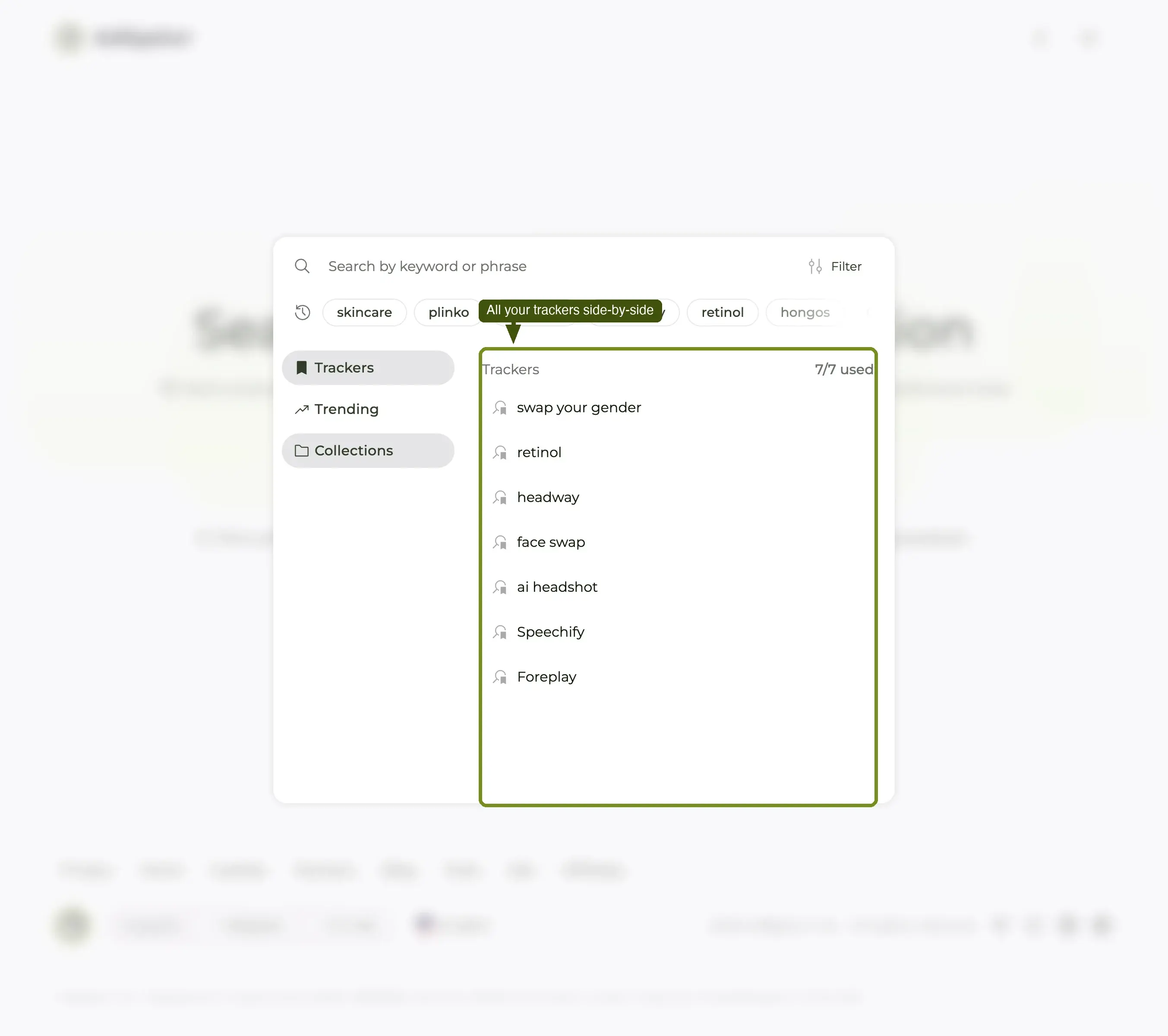
Step 2 — Set up Tracker A
Open Creatives, search competitor 1's FB page, apply any filters that scope the comparison (typical: GEO = your target market, Days active From = 30 to filter out tests). Save as Tracker.
Naming matters here. Use a consistent pattern across both Trackers so the side-by-side reads clean. Example: [Competitor] — US — winners. Both Tracker names use the same suffix; only the brand differs.
Step 3 — Set up Tracker B with identical filters
Search competitor 2's FB page. Apply the same filters as Tracker A — same GEO, same Days active range, same Display format if you used one. The comparison is only valid when the slice you're looking at is identical between the two brands.
If you forget a filter on B that you used on A, the differences in the Analytics tab will look bigger than they are. Discipline matters.
Save as Tracker B with the matching name pattern.
Step 4 — Open Analytics on Tracker A
Once a Tracker is saved, the Analytics tab unlocks. Open it on Tracker A first and skim the four panels:
- Launches over time — when does this brand push new creative? Steady drip or burst pattern?
- Visuals breakdown — image / video / carousel / DCO mix.
- Copy patterns — most-used phrases, hook structures, CTA distribution.
- Country mix — where the budget actually goes.
Don't analyze yet. Just absorb the shape.
Step 5 — Open Analytics on Tracker B
Same four panels, same time range. Resist the urge to look at one panel on A then one on B — read all four on A first, then all four on B. The brain stores patterns better that way.
Step 6 — Note the three biggest differences
By now you've seen eight panels (4 × 2 brands). The job is to pick the three differences that matter most. Use this lens:
Launch cadence
Does brand A drip-feed (steady weekly launches) while brand B does bursts (silence + big drop)? Cadence usually maps to internal team structure: drip = in-house creative team with a weekly slot; bursts = agency or external producer with a milestone-based contract.
Heatmap sub-view (inside Analytics) sharpens this — it shows day-of-week and hour-of-day. If brand A launches every Sunday evening and brand B launches every Wednesday morning, you've found a process difference.
Visuals mix
Is brand A 70% video while brand B is 70% static? That tells you what each brand believes about their audience and their production budget. Video-heavy brands have either an in-house editor or an outsourcing pipeline; static-heavy brands have neither and probably can't catch up quickly.
For your own briefing, the more video-heavy brand is the harder one to beat on creative pace. The more static-heavy brand is the easier one to leapfrog by shipping a few good videos.
Copy patterns
Compare the top-five phrases in each. Brand A might lead with "Up to 50% off" (price-led). Brand B might lead with "The last product you'll ever need" (positioning-led). That's two different theories of why their customer buys.
Note: if both brands lead with the same phrase, you've found the niche's dominant hook. Worth borrowing for your own creative.
Country mix
Does brand A have 80% of spend in one country and brand B have it spread across 12? That's strategy-level: a focused brand vs a globalized brand. Each carries different growth risks — focused brands are vulnerable to one-market disruption; globalized brands carry currency and translation overhead.
If you operate in one market only, the focused brand is your closer comparison and the better creative reference.
Step 7 — Write the three sentences
The output of this workflow is not a dashboard — it's three sentences a teammate can read in 30 seconds. Template:
Brand A ships cadence mostly format in market(s), leading with hook. Brand B ships cadence mostly format in market(s), leading with hook. The biggest strategic gap is the difference that matters most.
That's the deliverable. Three sentences. Anyone on your team — designer, founder, PM — can act on three sentences. They cannot act on eight dashboard panels.
Step 8 — Save the bookmark
Both Trackers are still active. Open the Trackers popup at the start of next week and you'll see only the new ads each brand has shipped since your last check, on both sides of the comparison. That continuous diff is the compounding value of this workflow — the first read takes 30 minutes, the weekly maintenance takes 5.
Common mistakes
- Different filters on A and B. The most common error. Triple-check that both Trackers share GEO, Days active, and Display format before reading.
- Comparing different time ranges. Analytics defaults to the lifetime of the Tracker. If A is 6 months old and B is 6 weeks old, normalize by setting both to the same window.
- Reading one panel at a time across brands. Read all four on A, then all four on B. The pattern recognition is better that way.
- Trying to compare three or more brands on the first pass. Two is the readable cap. After two, do a separate two-vs-two if needed.
What's next
The side-by-side is a snapshot. The longer-running version is to leave both Trackers running and re-read the Analytics every two weeks — the change in each panel is often more informative than the snapshot itself. For deeper feature-by-feature workflows, see the Trackers deep dive and the Analytics dashboard feature page.