Reading an Adligator creative card: every signal explained
A result card is dense by design — advertiser, run time, GEO, platforms, format. Here is what each element means and which ones to look at first.
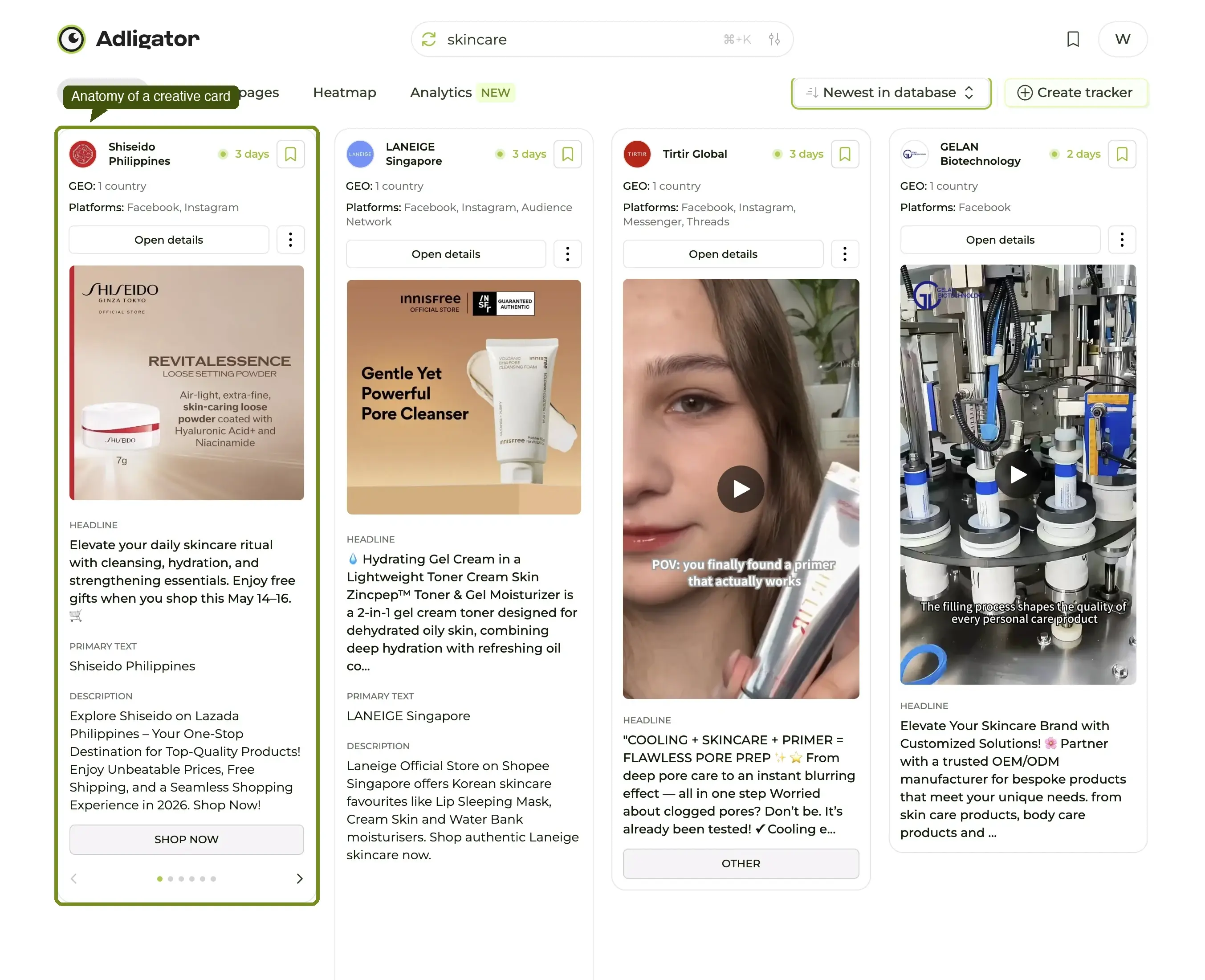
A single Adligator card squeezes eight pieces of information into a small rectangle. Once you can read all eight in under five seconds, the result grid stops feeling like a wall of ads and starts feeling like a shortlist. This article is the decoder ring.
Everything below applies to the Creatives tab. The same card layout is reused on Tracker views and Collection folders, so what you learn here transfers.
The anatomy, at a glance
A card has three zones — top, middle, bottom — plus an overlay row of badges. Read them in this order:
- Run-time badge (top-right) — how long the ad has been alive.
- Advertiser line (top-left) — who is running it.
- GEO line (middle, under the visual) — how many countries it targets.
- Platforms line (below GEO) — Facebook, Instagram, Audience Network, Threads.
- Format badge (overlaid on the visual) — Video, Carousel, DCO, Image.
- Headline + primary text (on the detail page) — the copy itself.
- Open details button — jumps to the ad's detail page.
- Bookmark icon (top-right corner of the card) — saves to your default Collection.
The first four signals together give you ~80% of what you need to decide whether to open the card. The remaining four are confirmation, not selection.
1. Run-time badge — the single most important number
The small pill next to the advertiser name reads "4 days", "73 days", or "Inactive 5 days ago". On active ads it shows continuous days live. On inactive ads it shows how long ago Meta stopped serving it.
Why it matters: long-running ads are the strongest signal an ad library can ever give you. If a brand has paid to keep a creative live for 60+ days, they are almost certainly making money on it — performance marketers do not pay to keep losers in market. A 4-day ad is a test; a 100-day ad is a confirmed winner.
Sorting the grid by Longest running pushes the highest-signal ads to the top. That single sort change is the difference between "what just launched" and "what is actually working."
2. Advertiser line — context before content
The advertiser line is the page name + verified-page check + a small avatar. Click the name and you jump to that page's profile inside Adligator, which is useful for two things:
- Confirming you have the right brand. "Ridge" / "Ridge Wallet" / "Ridge Coffee" all collide on search; the avatar usually disambiguates instantly.
- Browsing the rest of the brand's library. One click and you are in a brand-scoped Creatives grid with the same filters carried over.
If the page is unverified, treat the data as still useful but slightly noisier — unverified pages are over-represented in arbitrage, white-label, and gray-vertical advertisers.
3. GEO line — the audience width
GEO: 1 country vs GEO: 12 countries is one of the most underrated signals on the card. A one-country ad almost always means a fresh test or a market-specific creative; a 12-country ad almost always means a validated winner the brand has globalized.
If you run ads in a single market and you see a one-country ad from a competitor scoped to your country, that is gold — the creative is tailored to your audience's cultural filter. The filter-by-country recipe covers how to surface only this kind of ad with the GEO + "To" filter combo.
4. Platforms line — where the brand believes it works
A small icon row at the bottom of the card shows which Meta placements the ad runs on:
- Facebook — main feed and Marketplace
- Instagram — feed, Stories, Reels
- Audience Network — third-party apps
- Threads — Threads feed
- Messenger — sponsored messages
The mix tells you where the brand believes the creative is working this quarter. An IG-only ad is usually a Reel or Story optimized for vertical mobile; a four-platform ad is usually a horizontal evergreen.
5. Format badge — the visual at a glance
Overlaid on the creative thumbnail:
- Video — pre-roll auto-plays on hover
- Carousel — small dots indicate the number of cards
- DCO — Dynamic Creative Optimization (multiple auto-generated variants)
- Image — no badge; assume static if nothing is shown
- DPA — Dynamic Product Ads (catalog-driven)
The format choice itself is a signal. A brand running mostly video usually has either an in-house production capability or an external editor on retainer. A brand running mostly DCO is delegating creative selection to Meta's algorithm — common at scale, less common with smaller advertisers.
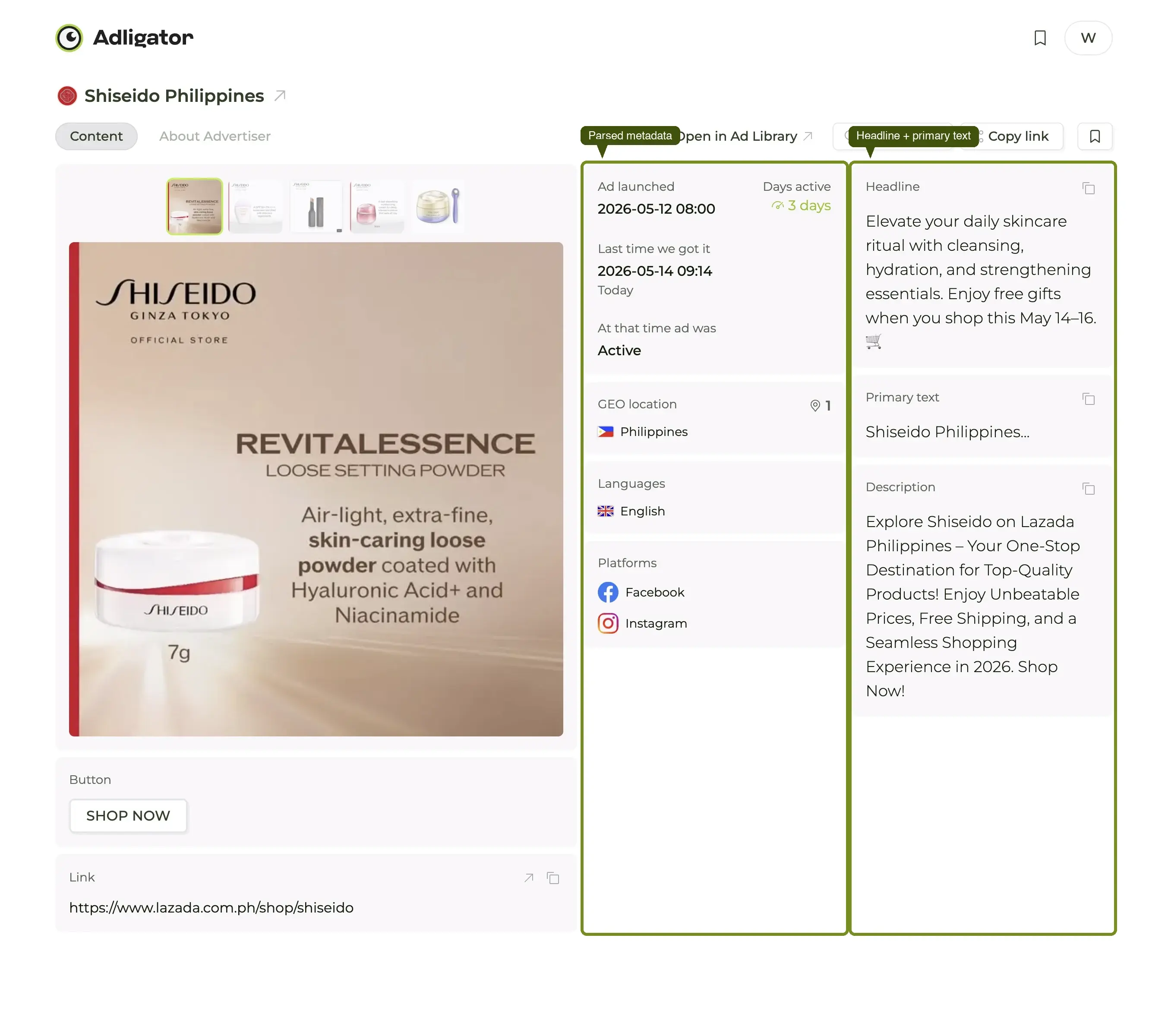
6. Headline + primary text — the offer
The ad copy itself lives on the detail page (one click on the card opens it). Two fields:
- Primary text — the long-form description above the visual on Meta's feed.
- Headline — the bold one-liner under the visual, usually paired with the CTA button.
The grid card deliberately doesn't show these — copy takes more vertical space than every other signal combined, and Adligator's grid is optimized for fast scanning. When you do click into the detail page, primary text is shown in full so you can read the first line — which is what the user actually reads in feed. If a brand has spent money figuring out a hook, it lives in those first 8–12 words.
7. Open details — the button that unpacks everything
A full-width Open details button sits below the metadata rows on every card. Click it and you land on the ad's detail page, which is where the rest of the article's signals come from: full primary text, headline, description, landing URL, parsed platform metadata, and a downloadable creative file.
The detail page is also where the right-rail metadata column lives — the one piece of UI most users notice on day one and remember forever. It is the column with parsed Ad launched, Ad stopped, Days active, GEO location, Languages, and Platforms — every field you would have hunted for manually inside Meta's Ad Library, lifted out for you.
8. Bookmark — save to your Collection
In the top-right corner of every card sits a small bookmark icon. One click saves the ad into your default Collection — no modal, no folder picker. The icon is always visible (not hover-only), so building a swipe file while you scroll is a single-finger workflow.
Bookmarked ads can later be organized into named Collections, exported, or compared side-by-side. The build-a-swipe-file recipe covers the full workflow.
Reading order, summarized
The five-second scan, for any card:
- Run-time badge — is this a winner or a test?
- GEO line — is the audience tight or globalized?
- Platforms — where does the brand bet?
- Format — what kind of production are we looking at?
- First line of primary text — what is the hook?
If three of those five line up with what you are researching, open the card. If not, scroll past.
Once you are fluent at the card, the next leap is fluent filtering — narrowing the grid before you even start reading. The filters deep dive is the reference for every knob in the app, and the glossary is the lookup for any term on a card you have not seen before.